Architecture is a field of several protagonists who work with the idea of shelter and evolve with different creative sensibilities. A protagonist must build a vision to include all dueling fraternities: the ones whose decisions affect others and the ones who get affected by them. Architecture outlives us and a protagonist only belongs to the continuity of history when imagined as a process of events over time. These are the conditions of ‘who we are’ and ‘where we have chosen to be’, which we must acknowledge.
In the State of Palestine, creative professionals along with inhabitants pursue this notion of architecture – as a means of insight and action – with temerity. The inhabitants of Palestine offer various political, economic, social and cultural explanations for their malaise. However, they commonly agree on the underlying problem and explanation: that Palestine is still Israeli-occupied. With the presence of Israeli forces, Palestine struggles to find an autonomous space for sole governance, clear land divisions and protection of its people and resources. Found in this political sanctuary of conflict over land and ethnic identity, between Israeli settlers and Palestinian Arabs, is the architectural practice RIWAQ.
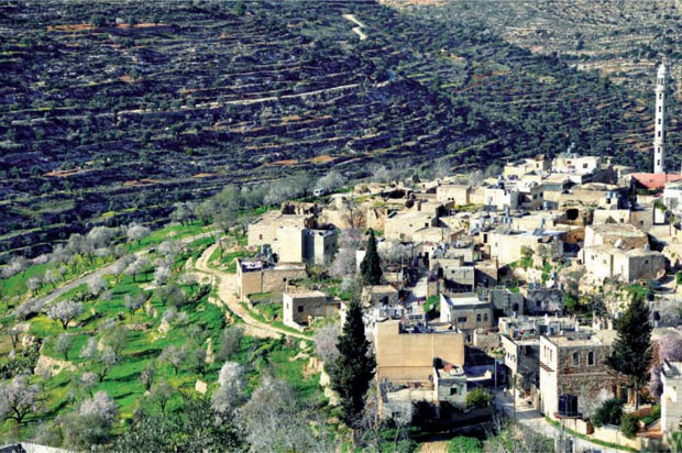
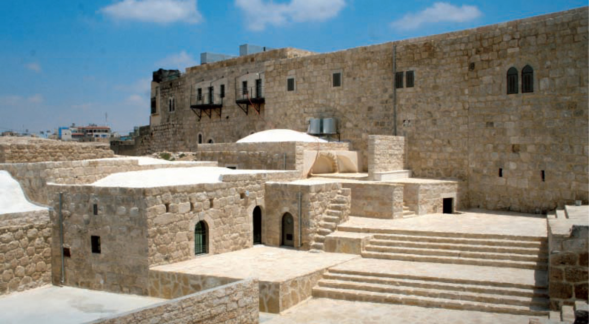
Founded by Suad Amiry in 1991, RIWAQ (an arcade, a transitional space between an interior and an exterior) has documented 52,320 buildings across 422 villages in the country. RIWAQ interventions in some of these buildings navigate harsh terrains – through the Gaza strip, Jerusalem and the West Bank – of pastoral landscapes dotted with weaponry. The office works out of Al-Bireh (north-east of Ramallah), a town in the heart of Palestine, close to Jerusalem and the school of architecture at Birzeit University. They work to protect and intervene in the heritage structures in Palestine and have developed a set of design tools, legal frameworks and ways of tackling the various problems that arise in this process.
How does RIWAQ define heritage architecture? How do they assert importance to a particular building and affirm it worthy of survival? “Heritage architecture, for us, is anything only built with local materials and skills, no imported materials. Generally, that involves stone masonry with lime mortar and spanning systems like arches and vaults, all in local stone hewn to proportions,” explains Khaldun Bshara, co-director of the company.
All the habitants have participated through generations, in making and remaking the identity of Palestinian villages by contributing their labor and imagination.
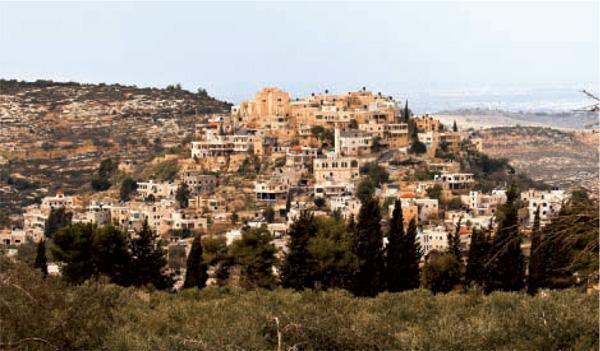
Palestinian heritage was defined according to 1923 British Antiquities Law, which only considered buildings before 1700 A.D. as heritage and hence worthy of protection. ‘Living’ heritage – structures that were built later than 1700 A.D., some still inhabited and used for simple everyday purposes – were not part of the aesthetics informed by colonial discourse. With an increasingly indistinguishable red-roofed built fabric of settlers and new Palestinian housing estates, RIWAQ works to protect this heritage, to expose the potential for creative interaction between tradition and technology.
While all citizens partake in lamenting about the country, most of the discourses are articulated by the writers, journalists, artists and architects in ways that clearly implicate their own uneasy sense of distinction. How do architects trained with architectural pedagogy in Palestine within the past 30 years – who pursued learning and practice in the West – translate their identities onto the city without coming across as a foreign voice? Due to the lack of knowledge of traditional building techniques, every building site since the inception of RIWAQ had to be a ‘workshop’ where the architects, the workers and owners all learnt these construction techniques while building. This was so that they could revive them, create subtle interventions and restore them into new structures. For the workers who were familiar with concrete or brick masonry, it became a process of un-learning contemporary methods of construction, learning traditional methods and striking a balance between the two.
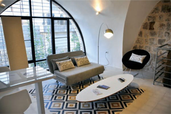
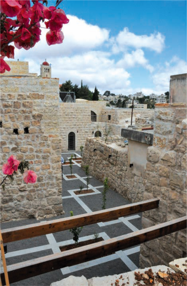
“We are not conservative in conservation. We encourage modern interventions in restoration work to add value beyond the historical sense. The way we live and work today is significantly different from 20 years ago and these changes are addressed with tools and technologies that are more relevant today. Heritage architecture cannot be viewed as a museum: untouched and preserved without use,” explains Khaldun Bshara.
Yet RIWAQ remains cynical of technological solutions for all problems. RIWAQ engages in a project with design-built expertise and brings monetary support through clients (as individuals or institutions). They empower people that labor over these buildings by providing a choice to design their own manner of living and their own aesthetics.
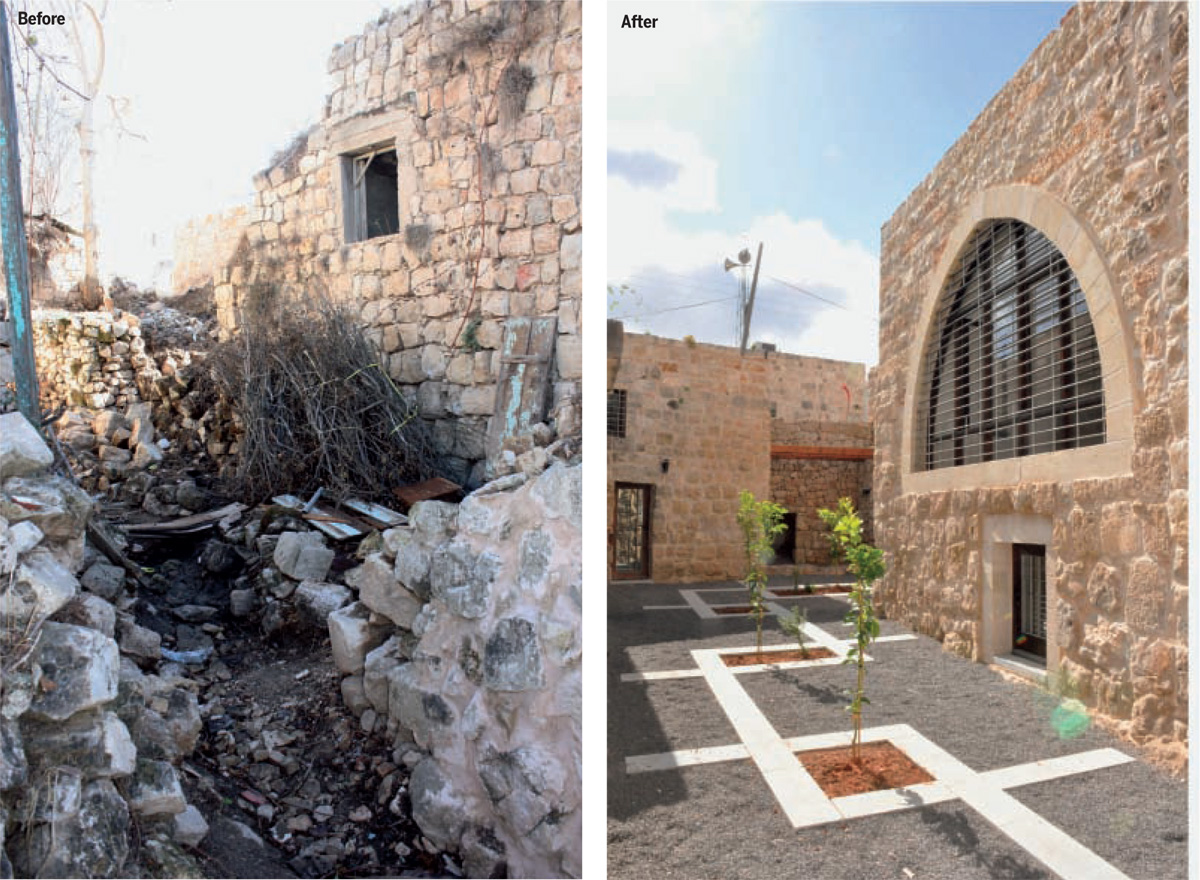
But how do they prove that it is more profitable to conserve than to tear down a building and start afresh? To compete with developers’ mode of intervention, they must invent profitable models of restoration. They are focused on two concerns with modern structures, which have always been addressed by traditional constructions. Firstly, feasibility of function-versus-cost, that is, minimal sophistication to existing structure but addressing fundamental things like weather conditions and heating-cooling systems. Secondly, structures that can provide for the original use, which they had been built for plus all uses that inhabitants can develop within them over time. RIWAQ intervenes when buildings are at their weakest. Owners who have given up hope over the sustenance of a building have to be promised that by introducing the building programme into the public domain, they will retain their ownership of the building and ensure its survival because people who use it will take care of it.
RIWAQ has a vision of Palestine as ‘cultural clusters’. Hence, they drafted larger projects integrating 50 historic centers across several villages to generate larger networks. In the case of the Birzeit Historic Centre, the intervention has several public programmes that try to encourage people to come out, gather together, discuss and enjoy, to take charge of public space. Working at the ‘local scale’ also means improving infrastructure and services for that scale. Their interventions create a strong relationship between new programmatic inserts and the way people actually live and work in Palestine. RIWAQ tried to bring the idea of co- ownership over the land to prevent possibility of developers’ making an exclusive settlement with the original owner or inherited owner(s). Much to their disappointment, the Palestinian State authorities are still sacrificing private commons: land owned ‘privately’ by a community. They took upon themselves the role of building belief in people. Through these historic centers, they aim to encourage interaction, mass communal events and work for lesser intervention of the State in public spaces.
RIWAQ includes buildings built by all people through history, even those who colonized Palestine because they are part of Palestinian territory and hence its heritage. They have been built by Palestinian labor and count as important pieces of architecture in the Arab country’s turbulent history. Throne villages (Qura-al-karasi) were built in the late Ottoman era (18th-19th centuries) to control Palestine and to collect taxes and people and send them to Istanbul. These throne villages ruled by kings (sheikhs) signify harsh control over Palestinians. Despite being houses of oppressors, they are beautiful pieces of architecture worth cherishing for structure and for diverse functions. These structures act as hybrid centers because they have a tone of oppression in history; yet, today, they are part of Arab culture and heritage architecture.
To think of conservation as a mode of self-development, RIWAQ propels the idea of community being the agent of change protected by a welfare state. RIWAQ lies on a critical margin between an unstable political regime in Palestinian villages, shifting pastoral territories and an urge to conserve architecture that is cherished with community living and ancestral homes. These buildings, faced with an incumbent fear of demolition, have driven RIWAQ to sow ideas of a ‘conserver society’. Restoration as resistance, advent of green architecture, historic centers as integral to the social spirit of communities – RIWAQ battles through rigid intellectual discussions so that these ideas become part of tacit knowledge.
RIWAQ cannot be viewed within the popular spectrum of conservation practice. Its role is rather forensic: events and built form studied not just to serve the problems of today but to testify to the problems of the future. Rather than witnessing an urban heyday with few iconic spatial markers, RIWAQ champions the inclusion of rich traditional practices to regain importance in public imagination and everyday lives.

Comments (0)